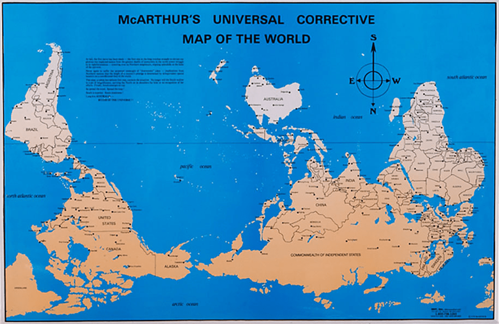
The Peters Projection map changed by view by gaining a new perspective for what it’s worth. Looking at the map and seeing the size of the United States being smaller in relative size to what it actually is makes you think of its importance. When laying out the map in a spherical way the land can be distorted and looking at greenland it seems to be a lot smaller than it actually is. Knowing that this map can be looked at and viewed as a more modern map with debate can cause one to question it. When I looked at MacArthur’s corrective map I seem to really like it because it’s not often that you look at the view of the world in an upside down fashion. When I look at the map, I thought, the land masses are so uneven and oddly shaped and looks like there is much more water than normal. In the pacific, I think there should be at least another island like Australia or even another continent to fill in the gap. I know we can’t just make a new continent but when people talk about how the population is steadily rising and soon one day we will not be able to live comfortably is concerning. After looking at these two maps, it got me thinking about what would stop me from making my own map based on a scale that I want to represent. Yeah, it most likely won’t be a widely adopted map but at least I could get a better perspective on a certain topic.
